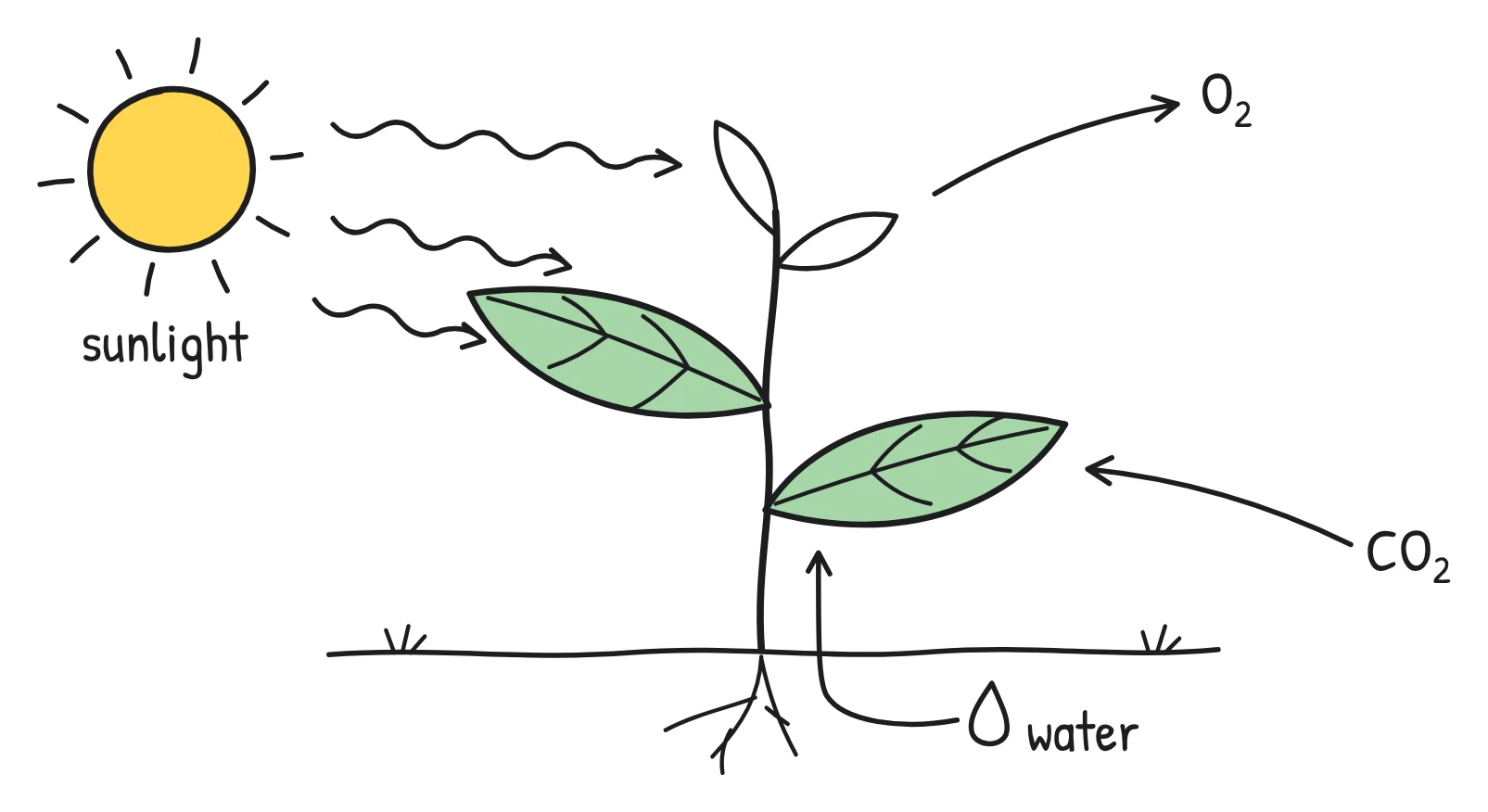
Do whiteboard videos actually help people learn?
Yes, there is reasonable evidence that they can, though less than vendors suggest. Controlled studies have found that watching diagrams being drawn while someone explains them can improve understanding compared with static slides, and that whiteboard animations can outperform narrated slides and filmed lectures. The likely reasons are not mysterious: whiteboard videos naturally follow several well-tested principles of how people learn from words and pictures. Most of the evidence comes from short lab experiments, so it tells you what tends to help, not that any whiteboard video will work.
What is Mayer's theory of multimedia learning?
Richard Mayer's cognitive theory of multimedia learning, developed over four decades, rests on three ideas. People have two channels, one for words and one for pictures. Each channel has limited capacity, so it is easy to overload. And meaningful learning needs active processing: selecting what matters, organising it, and connecting words with pictures and with what you already know. In a 2024 review, Mayer listed 15 design principles drawn from more than 200 experiments, each with an effect size and the number of tests behind it. The ones most relevant to whiteboard videos are below.
| Principle | People learn better when… | Effect size | Tests |
|---|---|---|---|
| Multimedia | they get words and pictures, not words alone | 1.35 | 13 |
| Temporal contiguity | words and matching pictures are presented at the same time, not one after the other | 1.31 | 8 |
| Modality | graphics come with narration rather than on-screen text | 1.00 | 19 |
| Personalisation | the words are conversational rather than formal | 1.00 | 15 |
| Coherence | extraneous material is left out | 0.86 | 19 |
| Spatial contiguity | words sit near the pictures they describe | 0.82 | 9 |
| Voice | narration is in a friendly human voice rather than a machine voice | 0.74 | 7 |
| Signalling | cues highlight how the material is organised | 0.69 | 16 |
| Segmenting | a lesson comes in learner-paced segments rather than one continuous unit | 0.67 | 7 |
| Redundancy | printed text is not added to narration and graphics in a fast-paced lesson | 0.10 | 12 |
A note on reading these numbers: bigger numbers mean a bigger average difference between the two versions of a lesson, and a principle backed by more tests is on firmer ground. The figures summarise experiments by Mayer and his colleagues, and Mayer stresses that every principle has boundary conditions: who the learners are, what the lesson is, and how it is delivered. They are strong starting points, not guarantees.
What is dual coding, and how does it fit in?
Dual coding is the idea, associated with psychologist Allan Paivio, that we handle verbal and visual information through separate channels. Mayer credits Paivio's 1986 book on dual coding as one of the influences on his own theory, and separate channels for words and pictures became its central feature. For video, the practical meaning is simple: a narrated drawing uses both channels at once. Your ears take the words, your eyes take the picture, and neither channel has to carry everything. That is also why the modality principle favours narration over on-screen text: text and pictures both compete for the eyes.
Why does watching the drawing appear matter?
The best direct evidence comes from Logan Fiorella and Richard Mayer, who ran five experiments in which students watched a short video lesson on the Doppler effect, published in the Journal of Educational Psychology. Some saw already-drawn diagrams while hearing the explanation. Others heard the same explanation while watching the instructor draw the diagrams by hand. Then everyone took retention and transfer tests.
- Full body visible (Experiment 1): watching the drawing improved transfer for learners with low prior knowledge (d = 0.58), but not for those with high prior knowledge.
- Only the hand visible (Experiment 2): the drawing group did better on transfer regardless of prior knowledge (d = 0.35).
- Drawing without the hand (Experiment 3): no significant advantage over static diagrams.
- Hand only vs full body (Experiment 4): seeing just the hand beat seeing the whole instructor (d = 0.36).
- Computer animation of the drawing (Experiment 5): diagrams animated to match the act of drawing did not significantly beat static ones.
The authors' explanation has two parts. Drawing step by step builds in signalling, segmenting and temporal contiguity: each part appears exactly when it's mentioned. And the instructor's hand may act as a social cue that encourages learners to make sense of what they see. The authors themselves urged caution: these were short lab lessons on a single topic, and the effects were modest.
What have studies of whiteboard animations found?
In a 2022 randomised experiment published in the Australasian Journal of Educational Technology, Selen Türkay showed 299 online participants one of two social science lessons, each about 10 minutes long, in one of four formats: whiteboard animation, narrated slides, a filmed on-stage lecture, or audio alone. The whiteboard group answered significantly more comprehension questions than the slides and lecture groups. The whiteboard and audio-only groups also reported more enjoyment and engagement than the others.
Two details keep this honest. Audio alone came second and was enjoyed as much as the whiteboard version, so pictures are not always essential, especially for topics like philosophy that have little spatial content. And the study lists its own limits: self-reported enjoyment, participants recruited online rather than real students or employees, no delayed test, and only two lessons.
Large-scale viewing data points the same way. Philip Guo and colleagues analysed 6.9 million video sessions on edX in 2014 and found students watched Khan-style tablet-drawing tutorials 1.5 to 2 times as long as slide or code-screencast tutorials. After drawing tutorials, 40% of sessions were followed by an attempt at the practice problem, against 31% for other tutorials. That measures engagement rather than learning, but engagement is a precondition for learning.
What about the “15% better recall” claim?
You'll often read that whiteboard videos improve recall by 15%. The figure traces back to a test by psychologist Richard Wiseman, described on the blog of VideoScribe, a whiteboard software product. According to that post, in 2012 Wiseman made a video of himself talking and a scribed version with exactly the same audio, then tested viewers' memory. It reports a 15% rise in recall across the memory questions, and 92% correct on one question for the scribe group.
The limits matter. We could not find a published paper, sample size, method or statistical test, and the account comes from a company that sells whiteboard software. It also compares a scribed video with a single talking head, not with good slides or diagrams. The result is consistent with the peer-reviewed work above, but it shouldn't carry weight on its own. If you cite it to a sceptical stakeholder, cite the controlled studies instead.
What design rules follow from the research?
Whiteboard style alone doesn't do the work. The principles behind it do. These rules turn them into decisions you can make when you script and design a video:
- One idea per scene (segmenting). Break the topic into short scenes and keep each video short. Our guide on how long a training video should be covers the length evidence.
- Draw it while you say it (temporal contiguity). Each drawing should appear as the narrator mentions it, not before or after.
- Put labels next to the thing (spatial contiguity). A label should sit beside the part it names, not in a legend at the side.
- Cut the decoration (coherence). Leave out jokes, background detail and side stories that don't serve the learning goal. Keep drawings to clean line art.
- Show the structure (signalling). Number the steps, use arrows for cause and effect, and say “there are three things” before you show them.
- Narrate, don't print (modality and redundancy). Keep on-screen words to short labels. Captions are still important for accessibility and for people watching with the sound off, but don't write the narration onto the drawing.
- Write like you talk (personalisation). Use “you” and “we”, short sentences and plain words. A policy written in legal language makes a poor script.
- Choose a warm, natural voice (voice). The research compared human voices with machine voices. Today's AI narrators are far more natural than the ones tested, but still listen to yours with a few real learners before rolling out.
- Name key terms early (pre-training). If the video uses three new terms, introduce them in the first scene, or in a short video before the main one.
- Add questions between videos (generative activity). Interpolated questions reduced mind wandering and improved learning of online lectures in experiments by Szpunar and colleagues. Put a quick check in your LMS after each short video.
If you are writing the script yourself, our guide to writing an explainer video script puts these rules into a scene-by-scene template. For a sense of where whiteboard sits against other styles, see whiteboard animation vs motion graphics.
Scene 1. Says Phishing emails usually do one of three things. They rush you, they ask you to click, or they ask for a password.
Drawn An email envelope in the centre with three numbered arrows pointing out to a clock, a cursor clicking a link, and a padlock with a question mark. Short labels next to each: “Rush”, “Click”, “Password”.
Scene 2. Says If an email does any of these, stop. Check the sender before you do anything else.
Drawn A hand-drawn stop sign next to the envelope, and a magnifying glass over the sender line, labelled “Check sender”.
When is a whiteboard video not the best choice?
- Step-by-step software tasks. If people need to click through a real screen, a screen recording shows the actual interface. Sketchflare doesn't record screens.
- Expert audiences. In Fiorella and Mayer's first experiment, learners with high prior knowledge gained nothing from watching the drawing. Experts may prefer a short written summary.
- Topics with nothing to picture. Türkay found audio alone worked well for social science lessons. If you are drawing pictures just to fill the screen, the coherence principle says leave them out, or consider a podcast-style format.
- Content that needs a real person. A message from the chief executive or a sensitive announcement may land better from a human on camera.
For everything else, especially processes, policies, cause and effect, and concepts that can be sketched, whiteboard is a strong default. Pair it with a short, well-structured script and you're using the research rather than the myth. When you're ready to make one, start with how to make a whiteboard animation.
Questions
Are whiteboard videos more effective than other videos?
In some controlled studies, yes: whiteboard animations beat narrated slides and filmed lectures on comprehension, and watching diagrams drawn by hand beat static diagrams. The studies are mostly short and lab-based, so the benefit depends on good design rather than the style alone.
Why are whiteboard animations so engaging?
Researchers suggest the step-by-step drawing guides attention to what is being explained at that moment, and a visible hand may act as a social cue. On edX, students watched tablet-drawing tutorials 1.5 to 2 times as long as slide-based ones.
Is the 15% recall statistic for whiteboard videos true?
It comes from a 2012 test by Richard Wiseman described on VideoScribe's blog, with no published method or sample size. It is consistent with peer-reviewed work but should be treated as an anecdote rather than evidence.
What are Mayer's multimedia learning principles?
They are evidence-based rules for designing lessons with words and pictures, such as using narration with graphics, removing extraneous material, signalling structure and splitting lessons into segments. Mayer’s 2024 review lists 15 of them, each with an effect size.
Should a whiteboard video show a drawing hand?
Fiorella and Mayer found that watching an instructor draw helped when the hand was visible, but not when it was hidden or replaced by computer animation. It's worth testing a version with a hand, especially for beginners.
Sources
- Mayer (2024), The past, present, and future of the cognitive theory of multimedia learning, Educational Psychology Review
- Fiorella & Mayer (2016), Effects of observing the instructor draw diagrams on learning from multimedia messages, Journal of Educational Psychology
- The Learning Scientists: Multimedia learning, back to the drawing board? (authors’ summary and caveats)
- Türkay (2022), Comparison of dynamic visuals to other presentation formats when learning social science topics in an online setting, AJET
- Guo, Kim & Rubin (2014), How video production affects student engagement: an empirical study of MOOC videos
- VideoScribe blog: The psychology behind whiteboard videos and 15% learning increases
- Szpunar, Khan & Schacter (2013), Interpolated memory tests reduce mind wandering and improve learning of online lectures, PNAS